Happy Friday the 13th y’all! As huge fans of horror and “spooky stuff,” we can definitely attest that horror and aesthetics are a big deal for fans of the genre. Think of how many perfectly good horror films can suddenly be ruined by a bad monster costume, or bad special effects. These things matter!
With that said, while many horror/spooky genre sites can definitely follow similar formats and styles, these 13 throw that out the window for something much more pleasing and fun.
Lore
http://www.lorepodcast.com/
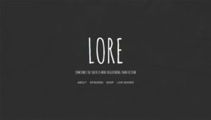
A great example of ‘less-is-more’, Lore doesn’t focus on distracting you with sidebars, unnecessary content, they just want you to listen to the episodes. Released bi-weekly, it’s also a great podcast to listen to if you’re into true horror stories.
Monster Brains
http://monsterbrains.blogspot.com/
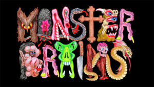
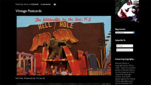
Not only is Monster Brains one of the best named sites out there, but it’s possibly the largest online collection of monster and horror inspired art. Everything from postcards photos of theme park rides to obscure vintage art from across the globe, everything is posted in almost larger-than-life digital images.
Ben & Jerry’s Flavor Graveyard
http://www.benjerry.com/flavors/flavor-graveyard
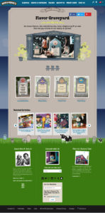
An awesomely cute collection of the “dearly de-pinted” – Ben & Jerry’s Flavor Graveyard is a collection of flavors no longer in production. Each flavor has a description and timeline of when it was in production.
Bleeding Skull Video
http://www.bleedingskullvideo.com/
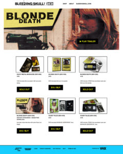
The charmingly humble duo of Joseph Ziemba and Zack Carlson, host and former host of Alamo Drafthouse’s Terror Tuesdays and contributors to Bleeding Skull, have teamed up with Mondo to publish never released “or barely released” horror and exploitation flicks from around the world. Each release also comes with a special zine only available with each copy and in some cases they even have exclusive art. The website itself is very similar to the design of Mondo’s own site, clean backgrounds and typography that highlight the strength of the art and design put into each packaged film.
Mondo
https://mondotees.com/
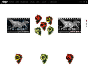
Mondo of course is one of the most popular publishers of horror (and non-horror) soundtracks on vinyl, and other nerdy/pop-culture goods. Clean, black and white, and well thought out fonts highlight the strength of the design work put into their products.
Dinosaur Dracula After Dark
http://dinosaurdracula.com/blog/category/after-dark/
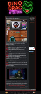
Fans of Dinosaur Dracula already know it’s one of the most charming blogs out there when it comes to horror, retro pop culture, and toys. Many may not be aware of Dino Drac ‘After Dark’, a somewhat design throwback that explores the more obscure and fun part of videos on YouTube. Postings made almost every night after 11pm, go back and check out the awesome Halloween posts!
Week In Weird
http://weekinweird.com/
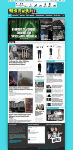
Greg Newkirk and Dana Matthews have been writing and posting about weird and off-beat news for a decade now. Their site is a great example of fun, but professional. If you were a fan of Weekly World News as a kid, you’ll get a great big kick out of the humorous design work they do for some of their top stories.
Coast To Coast AM
http://www.coasttocoastam.com/
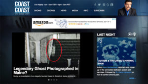
Speaking of paranormal news, Coast to Coast has been a late-night staple for fans of the paranormal for over 30 years. Even if their stories and news are from the fringe, their design work is not. Clean, easy to navigate, and their white and blue approach throughout the site is a great example of enforcing the colors in their branding.
Atlas Obscura
http://www.atlasobscura.com/
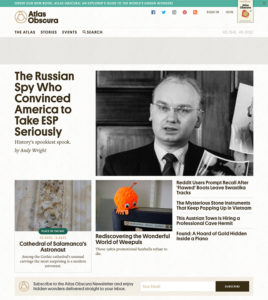
“The definitive guide to the world’s wondrous and curious places” is also a great guide to the strength of grid based designs. Much like fun and obscure places are scattered about the globe, color is used throughout the site to highlight – and never owerpower – everything from call-to-actions and related articles. Highly recommended for anyone who likes to take the road less traveled.
Feral House
http://feralhouse.com/
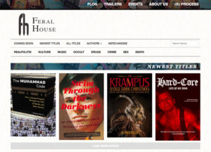
Feral house has been publishing off-beat and unusual non-fiction books for almost twenty years. Much like Atlas Obscura, they stick to a rigid grid but have fun with it. Colorful borders, and book covers adorn the site – making it tempting to buy everything they have in stock.
The Homicidal Homemaker
http://www.thehomicidalhomemaker.com/
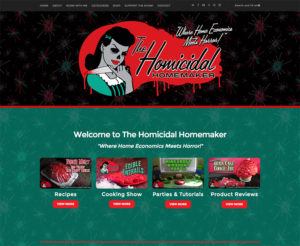
Kaci Hansen, the Martha Stewart of the Macabre, is proof that not all horror-themed sites need to have white text on black backgrounds or have gorey imagery splattered about. Colorful videos and photography are also consistent throughout the site, showing that dark and gloomy isn’t the only solution for “spooky”.
Strange Kids Club
http://www.strangekidsclub.com/
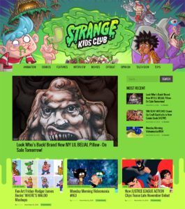
If you ever saw the back of a cereal box and thought “how can I turn this design into a website”, well Strange Kids Club beat you to it. Primary colors abound, hard edges, and horror and cartoon characters crank this fun pop-culture blog up to 11.
The Outbreak
http://www.survivetheoutbreak.com/
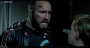
More of a fun example of execution than design (we’ve already talked about how we should all be moving away from Flash) – The Outbreak is an “interactive movie” that plays like a Choose-Your-Own adventure. Can you make it through the game without getting eaten? Special props should be given to the Chapter Select screen, which shows you what branches you’ve already explored if you need to suddenly go back and try something else.
Special shoutout:
Crystal Lake Wines
http://adrienneking.com/CLW_1.html
Fans of the original Friday the 13th movies of course are very familiar with Jason’s mom, actress Adrienne King. While the site is more charming in a web 1.0 way, it just seemed like the best time to let people know that she also sells Crystal Lake wines. While there’s a minimum order of 3 bottles, with five different wines to try why not just get them all?
