How do you know what is good web design?
Most people can recognize when one design is better than another, but can’t pinpoint why.
Only a designer will think, “These colors compliment each other and there is well-proportioned white space the typography.”
To most people, it feels like instinct, like the way they can pick out a perfectly ripened apple. They just know.
But there’s more to good web design than how it looks — it has to function.
The combination of form and function are what sets apart good web design from just “okay” web design — and can make a difference to how your audience interacts with your website. For these examples let’s explore how Apple brings their website design together with a minimalist approach.
1. People
With so much focus on the product, the service, the information, don’t forget about what matters most: people.
People will be using your website, and it’s important to understand your audience. Why they’re there, what they want, what do they expect? Don’t let gimmicks and flashy artwork get in the way of delivering your message or hinder your audience from wanting to use your site in the first place.
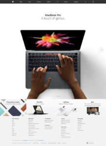
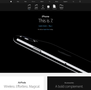
Apple places a focus on the product, but there are no unnecessary distractions. The product is upfront and center, with easy-to-read content and simplified call-to-actions to explore more about the products.

2. Emotions
It’s not just about what you do — it’s about how your product or service can make someone feel.
Bring emotions into your website through design. For example, are you a specialized plastic surgeon? You would want your site to look professional and adult, rather than like a pediatrician’s website. Colors, fonts and layouts make a difference in conveying how your brand is perceived.
Presenting the products in a desirable layout to invoke an emotional response is Apple’s specialty. The hard contrast of black and white with a teasing silhouette makes the product mysterious, and even sexy.

3. Stories
There’s more to your brand or website than a simple reason of the offering of a product or service. People fall in love with companies because they have stories to tell.
With a website, you can tell your stories through photography, content and video. Make the story an interesting read with discovery and encouraging your audience to look around with compelling call-to-actions (CTAs).
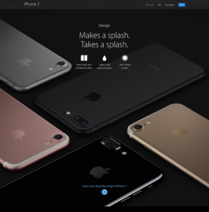
Notice how there isn’t just a block of text you have to read? The product and text is displayed in an interesting arrangement, which changes as you scroll down. Easily recognizable CTAs are in a different color to clearly stand out.

So where to go from here?
There is always room for improvement, especially when it comes to website design. What is current now could be outdated in 6 months.
It’s important to realize websites are ever-changing and age, just like us.
And just like us, we can do even simple things to make them better.
